

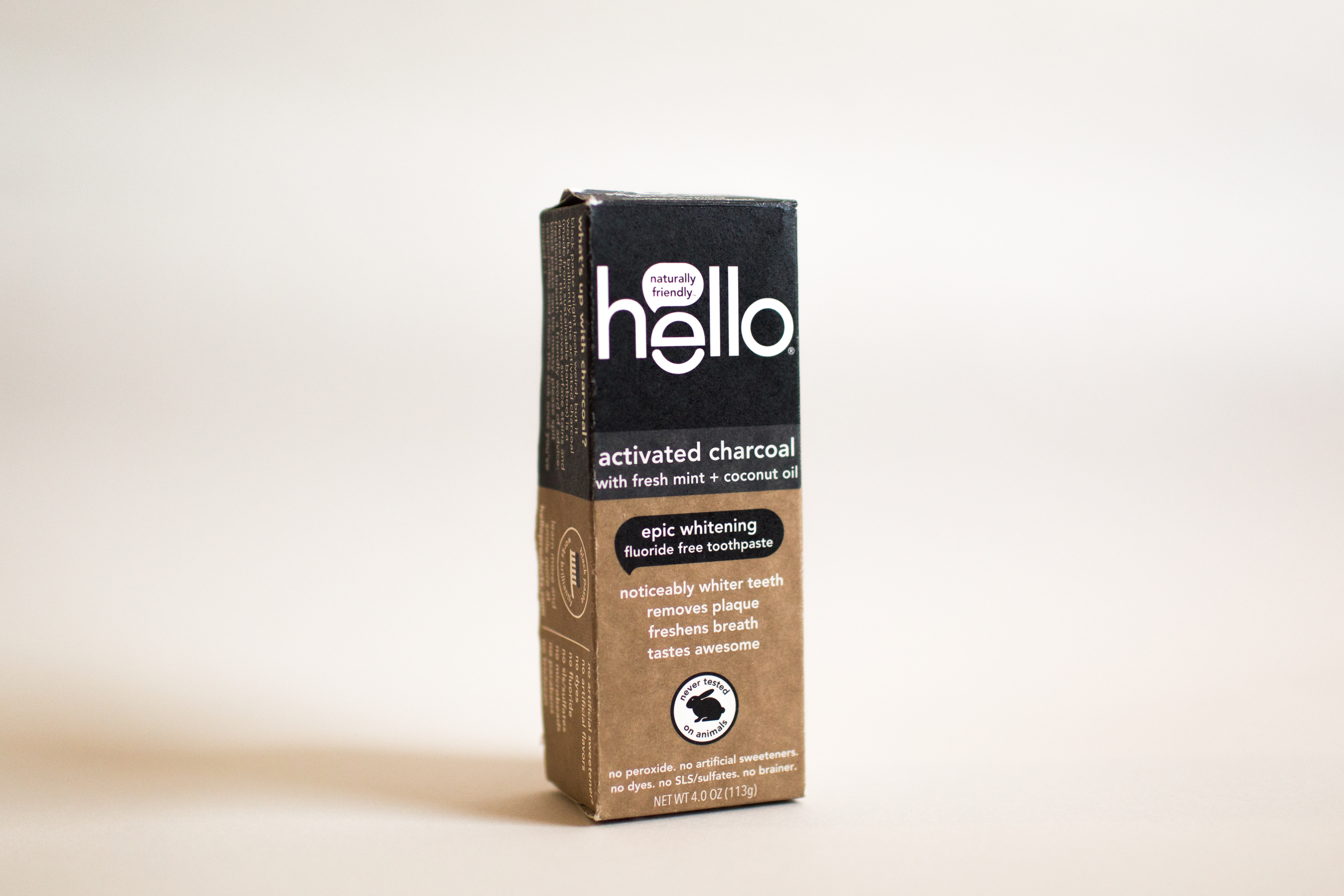
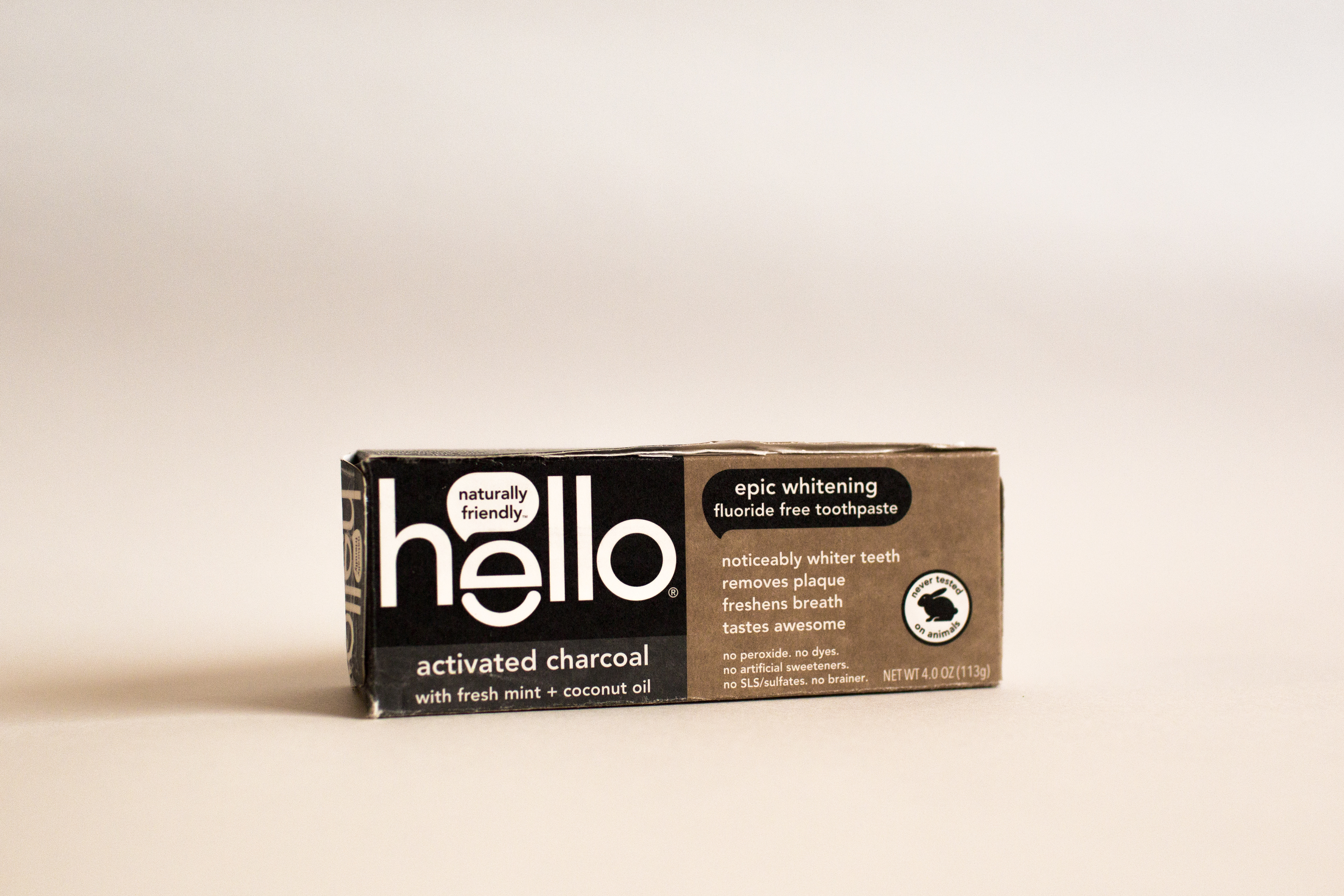
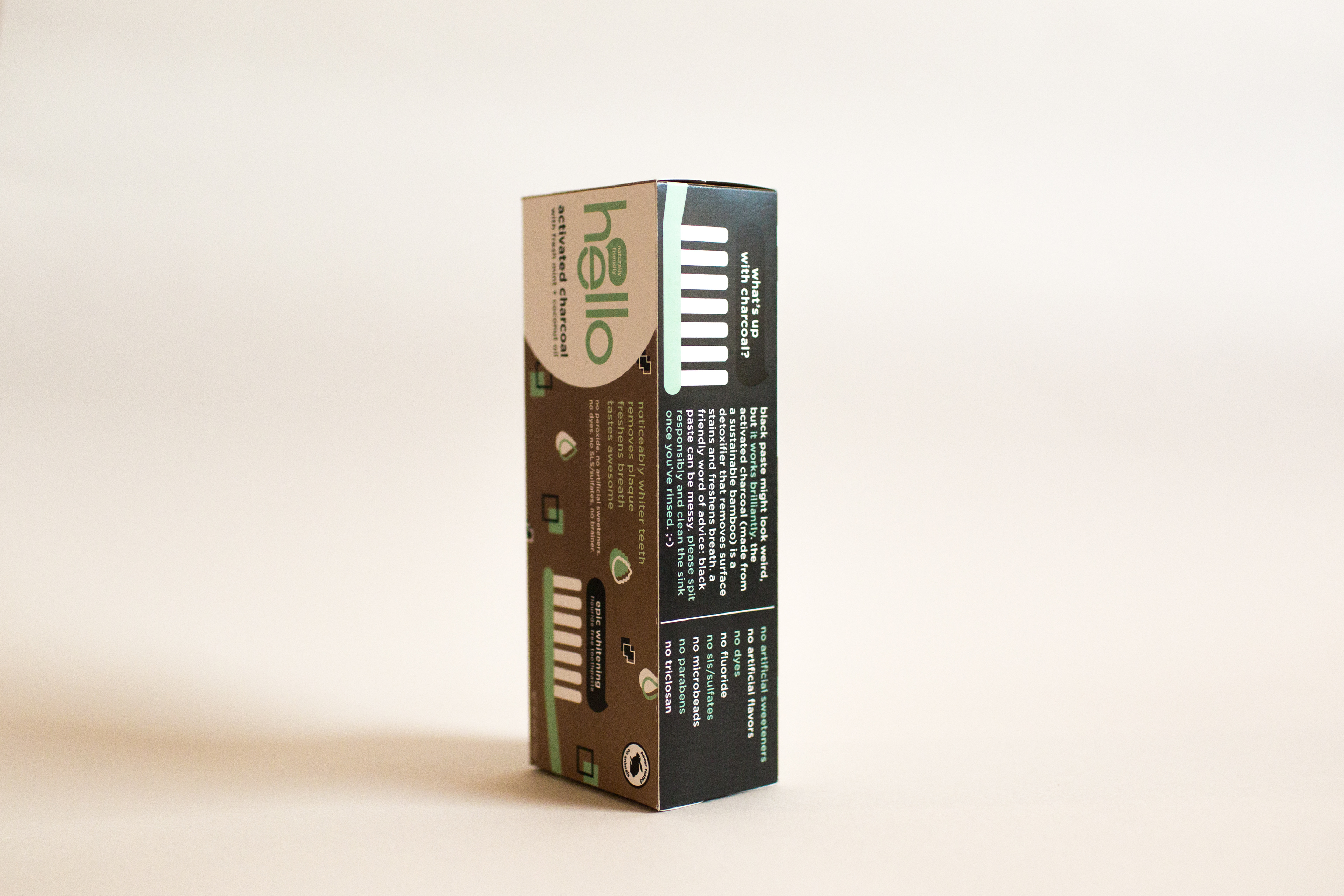
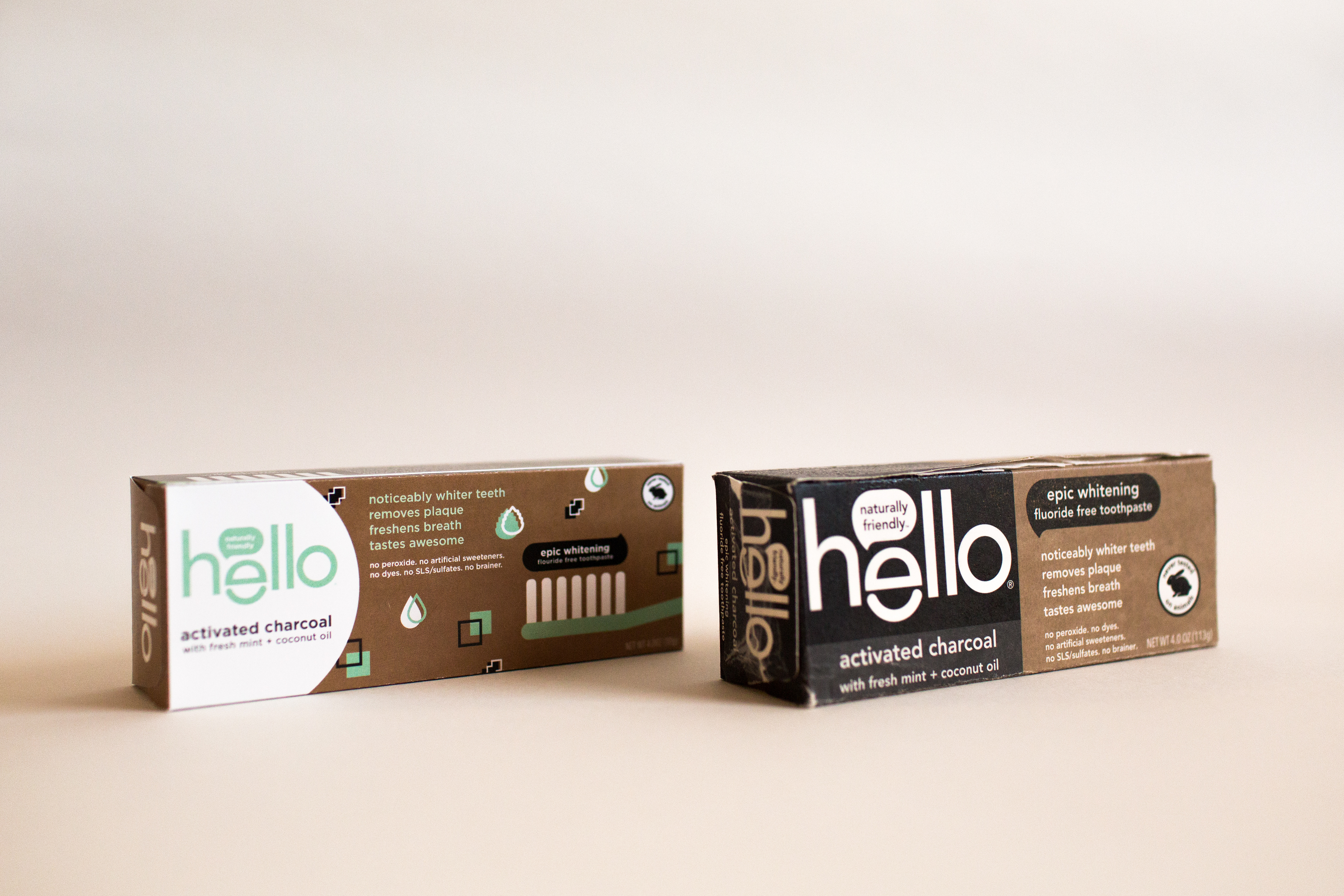
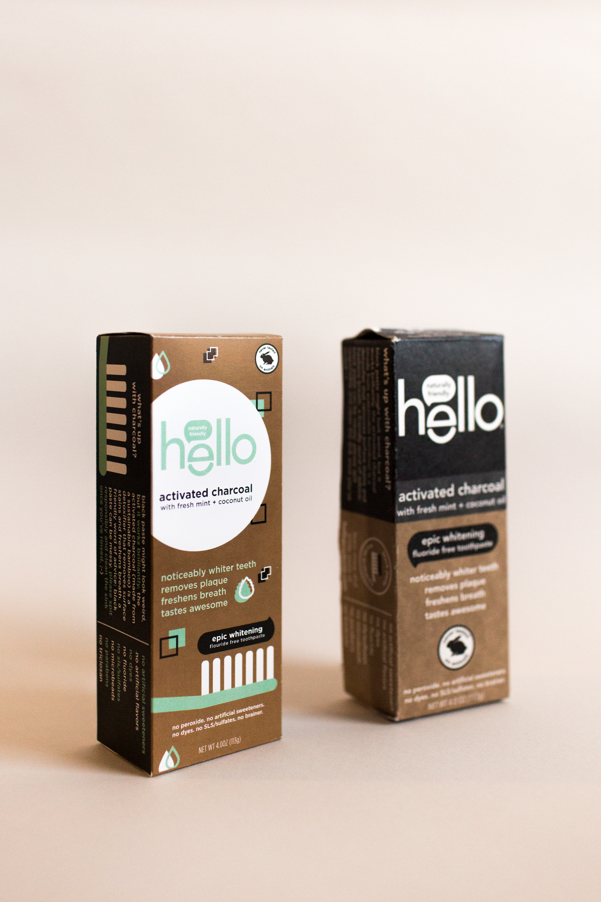
After researching the company, a few words that encapsulate their brand are fun, edgy, natural, and young.
What I noticed about their packaging is that it emphasizes the natural aspect of their brand and products, but not the fun and edginess present on their website.
Also, it is initially difficult to tell that the product is toothpaste. When I asked others to tell me what they thought it was at first glance, I received answers from hair dye to ink cartridges.
My goal was to keep the natural aspect, but also to incorporate fun and fresh elements that more clearly communicate that the product is toothpaste. So I designed.
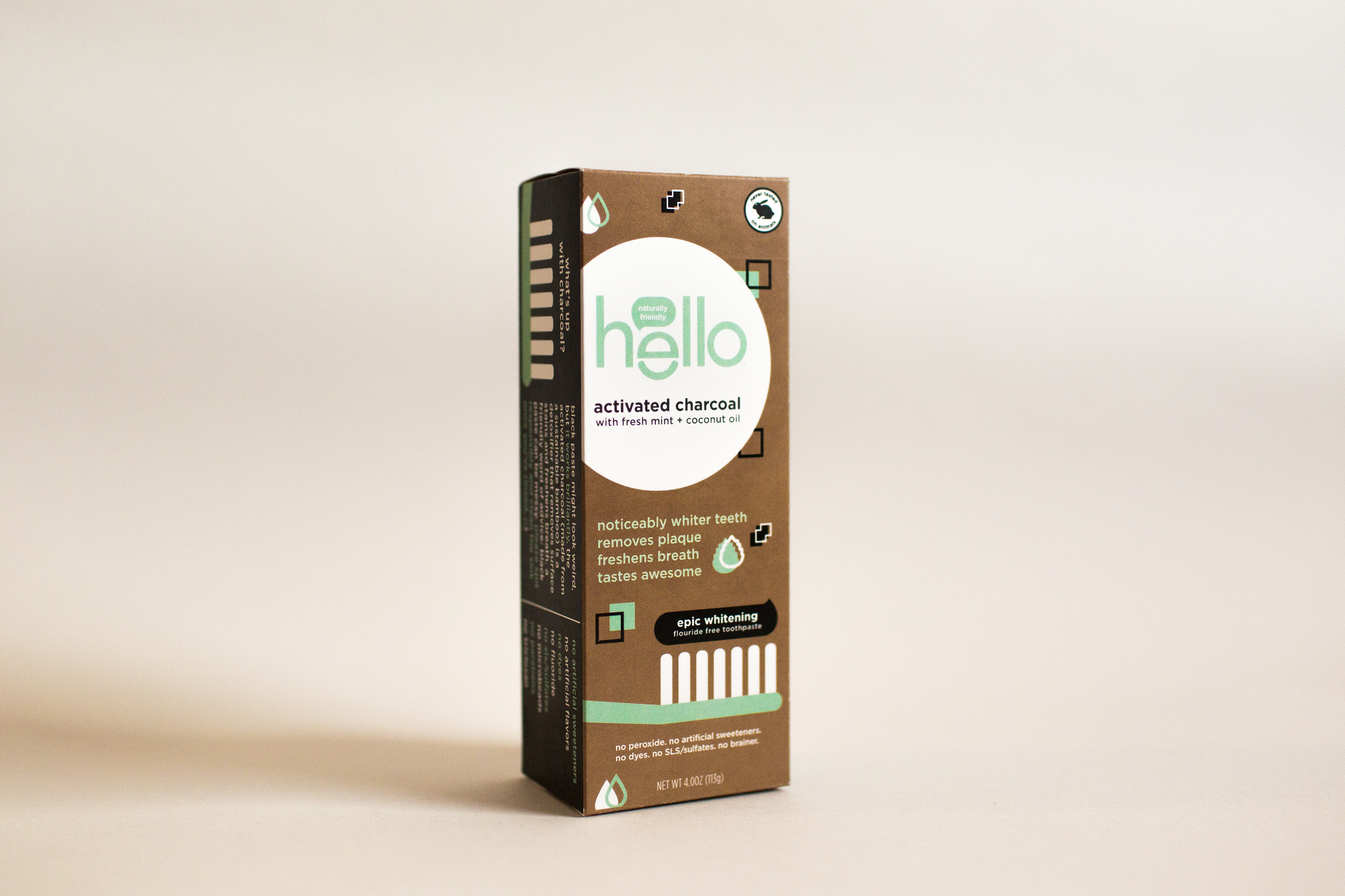
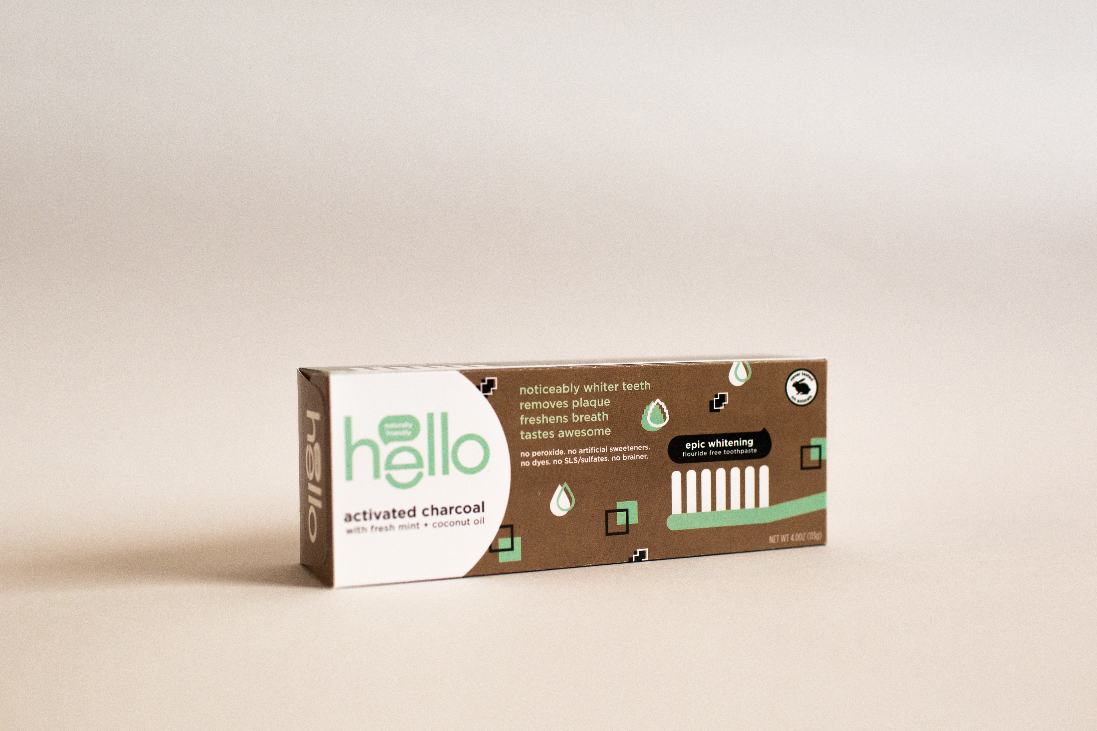
My focus was on clarifying the visual hierarchy, including elements that immediately signal to the shopper that it is toothpaste, and incorporating a mint color and design elements that bring freshness and fun to the packaging.
Side-by-side photos for comparison:
I love packaging, and this project was an absolute blast.