
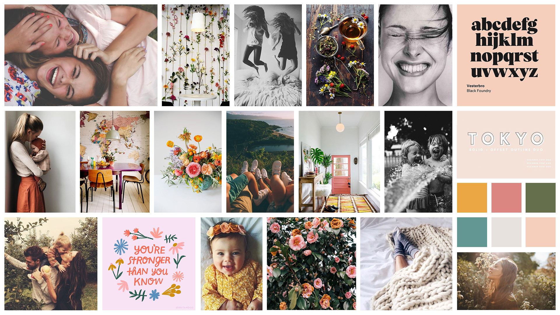
First up: defining the brand and creating a mood board.
Words I drew from were:
Words I drew from were:
life, bright, joyful, abundant, peaceful, happy, warm, and secure.
Then I moved on to black & white logo sketches.


I chose three to refine, and the first one out of the three below became my choice with which to move forward to the final design.


During the process, I chose to replace the hand-written words with a rounded sans-serif typeface and decided on a red and blue color palette.
The red heart represents love and warmth, and the blue net/blanket symbolizes care and calmness. The design elements, from the imagery to words, are rounded, soft, and nonthreatening.
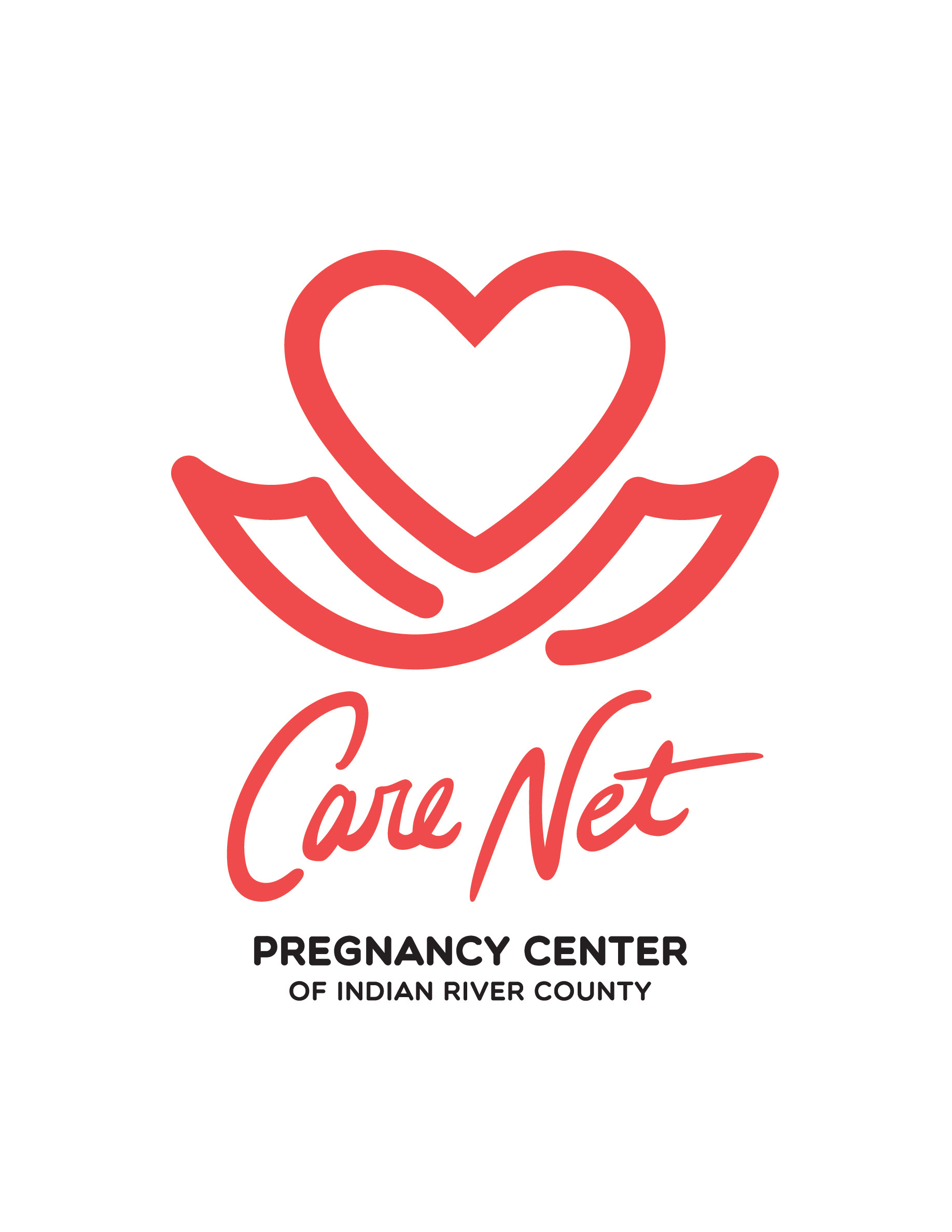
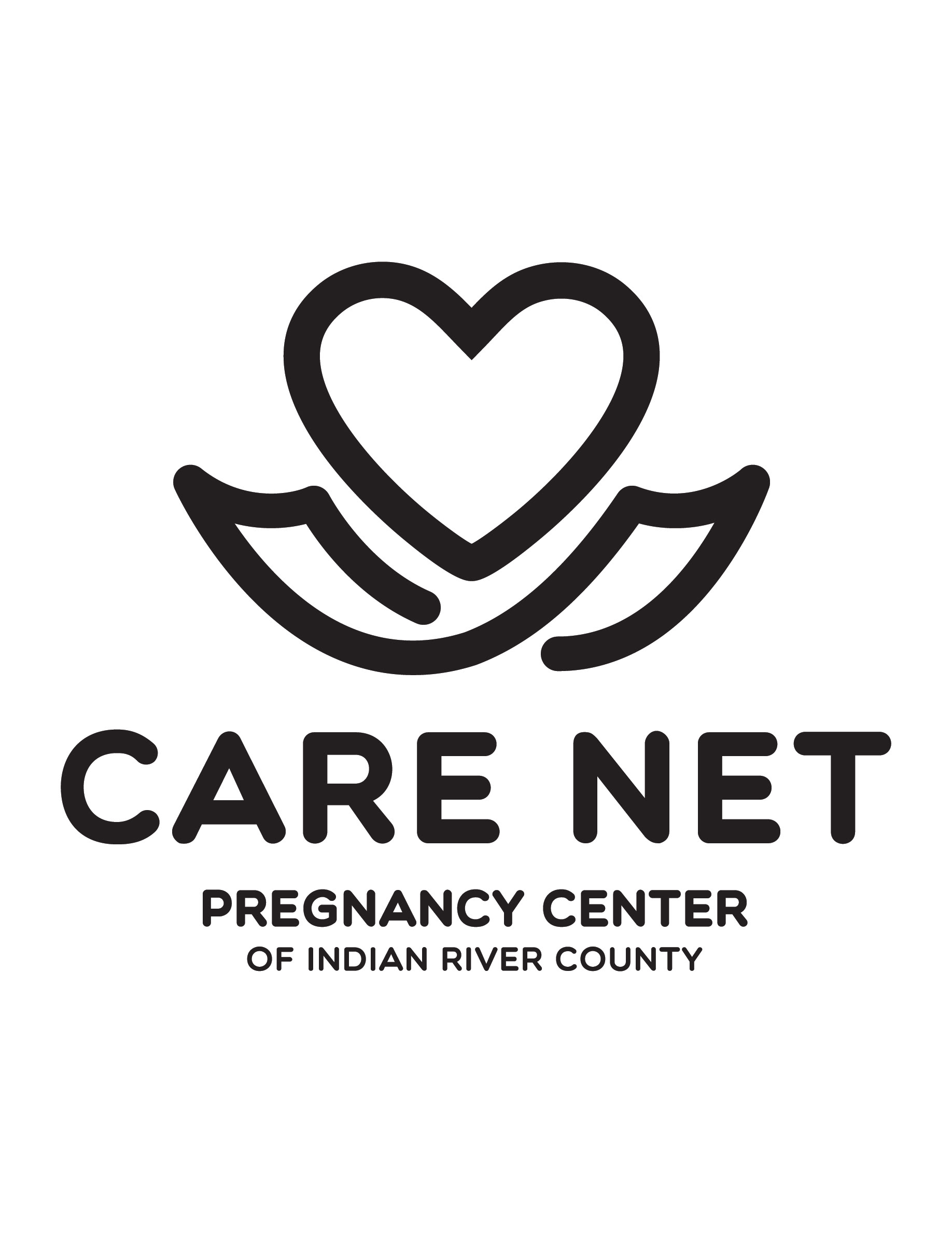


The final version is shown below in different uses for the center.

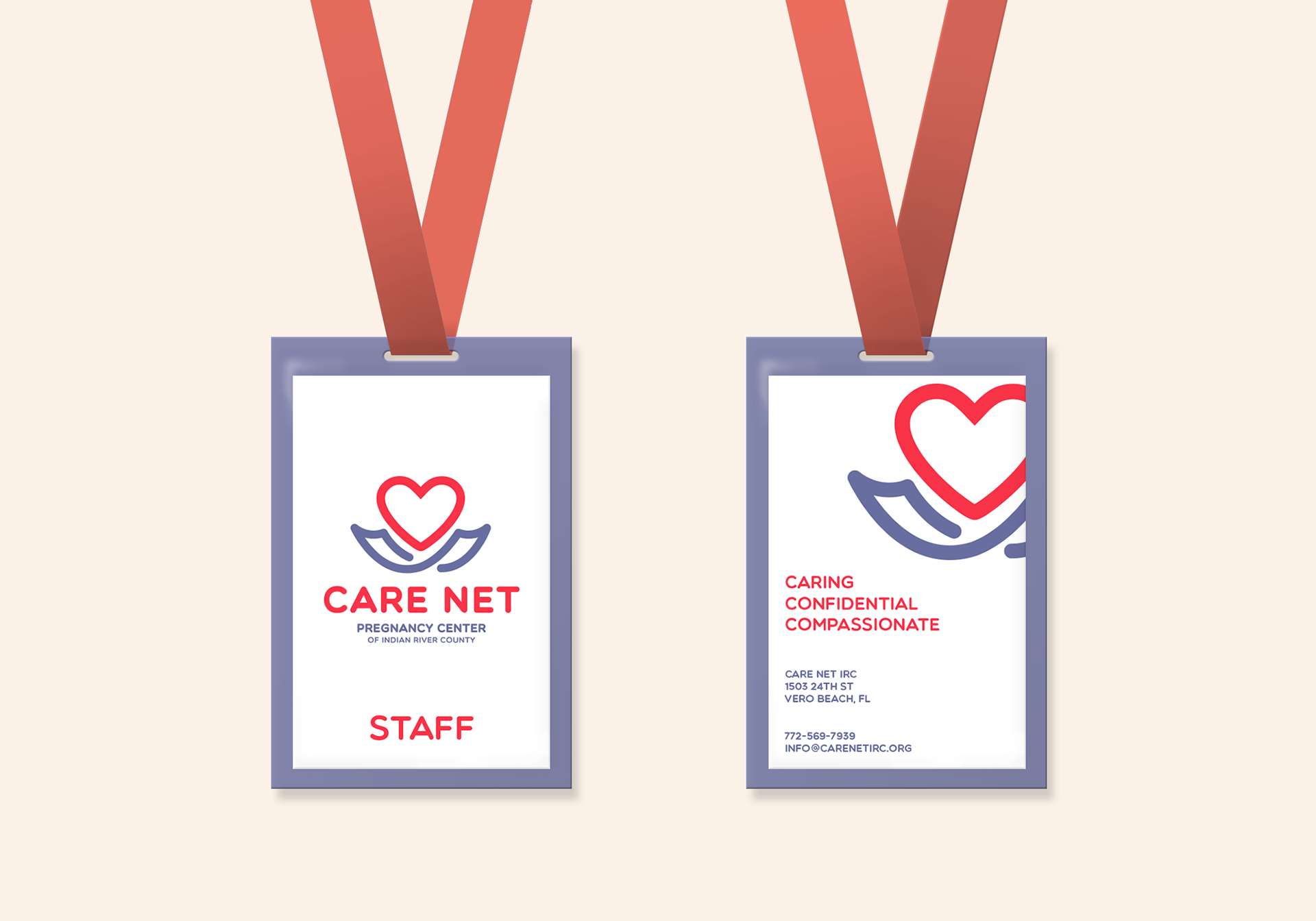
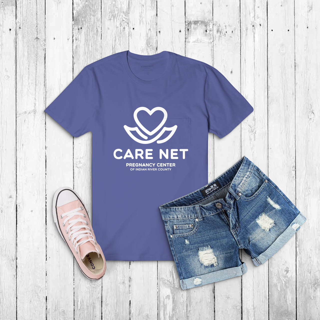
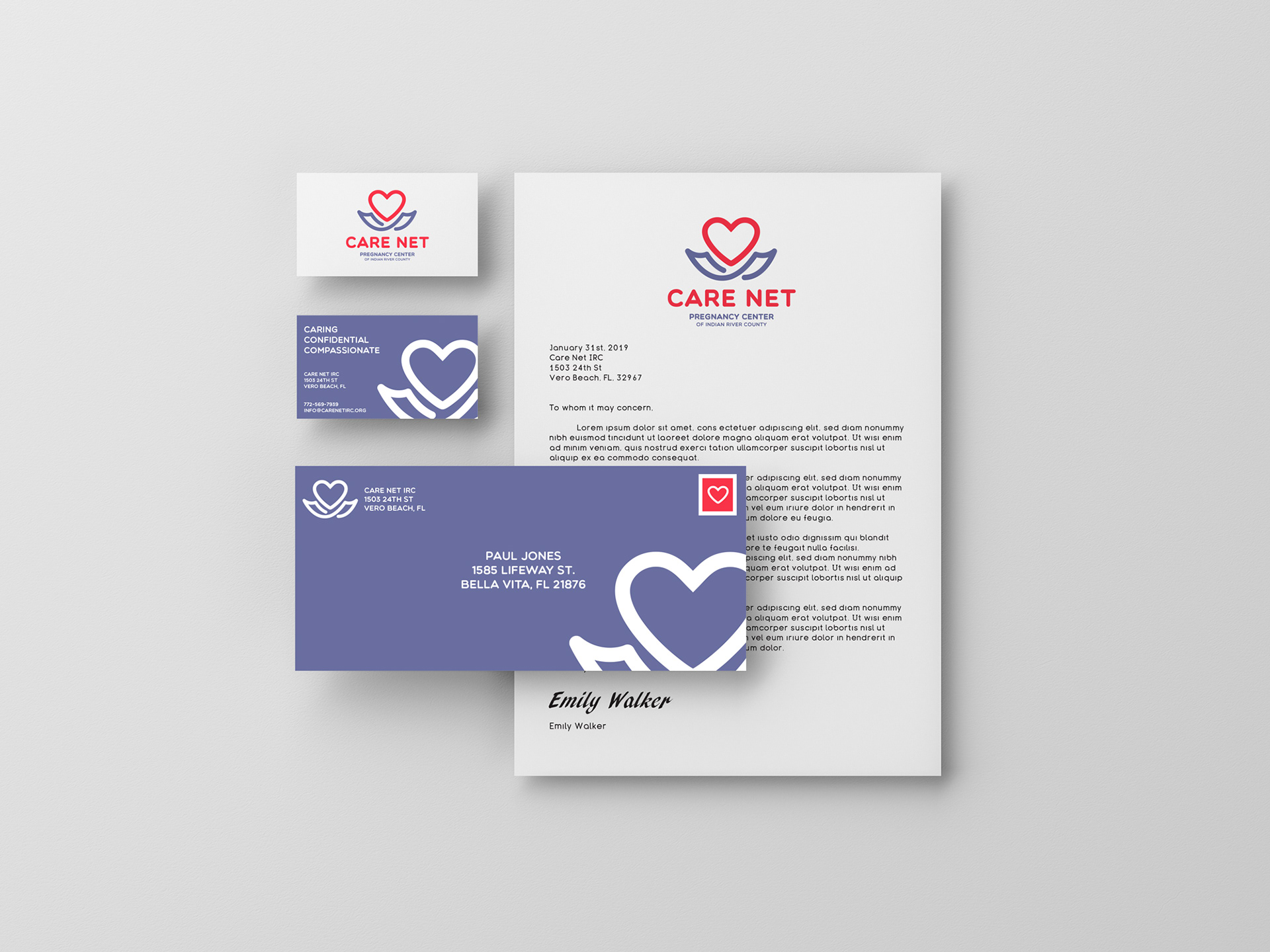
Mockup credit: Anthony Boyd